Sponsorship Analytics in 2026: The Complete Guide to Measuring Every Asset, Feed, and Partner
Quick Summary & Key Takeaways
Here’s a number that surprises most people the first time they see it. In Trajektory’s own market data, the Indiana Fever generate about $78,000 in av...
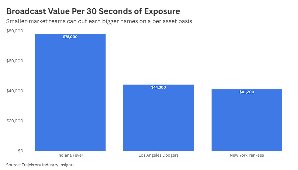
Here’s a number that surprises most people the first time they see it. In Trajektory’s own market data, the Indiana Fever generate about $78,000 in average value for every 30 seconds of broadcast exposure. The New York Yankees, a franchise with a far larger national following, generate roughly $41,200 for the same 30 seconds. The gap isn’t about audience size. It comes down to what the benchmark actually prices: real time viewership and exclusivity within that specific broadcast window, not total follower count or brand recognition.
That gap is exactly what sponsorship analytics is supposed to catch, and what a standard recap almost never does. Most sponsorship reporting still tells a partner how many impressions their logo picked up last quarter. It doesn’t tell anyone whether that exposure was actually worth what they paid for it, which assets are underperforming, or what needs to change before the renewal conversation starts.
This guide walks through what sponsorship analytics means in 2026, why the category has moved well past counting impressions, and how to measure a partnership across every asset it touches, not just the channels that happen to be easy to screenshot.
Sponsorship analytics is the practice of capturing, valuing, and reporting on every asset inside a partnership, from signage and broadcast mentions to social content, digital placements, and radio reads, so exposure can be turned into a defensible dollar value and compared across partners, properties, and time.
That’s broader than what most tools currently do. A lot of “sponsorship measurement” is social listening or broadcast logging with a dashboard bolted on. Real sponsorship analytics goes further in three ways. It brings every asset type into one methodology, so a static sign, a radio read, and a social post can be judged on the same terms. It converts exposure into value using consistent inputs like reach, frequency, duration, and market benchmarks, not just raw counts. And it connects that measurement to actual decisions, pricing, renewal, reallocation, and reporting, instead of stopping at a recap nobody reads twice.
Why 2026 Looks Different
A few shifts have pushed sponsorship analytics from a nice to have into something closer to table stakes.
Feeds multiplied, and they don’t agree with each other. A single game might now be captured across a local broadcast, a national feed, an away market feed, and social clips cut from all three. Each one shows a different amount of sponsor exposure. A team relying on just one feed is working from a partial, and often misleading, picture.
Buyers expect a direct answer, not a login. Brand and agency stakeholders are increasingly typing questions straight into search or an AI assistant, things like how sponsorship value gets calculated or which platform actually tracks ROI, and they expect a clear, sourced answer rather than a dashboard they have to dig through themselves.
Physical assets stopped being invisible. Signage placement, duration, and audience flow inside a venue used to be the hardest thing to measure and the easiest thing to undersell. Better capture has made that inventory measurable, and rights holders who still can’t measure it are leaving real value on the table.
A Framework in Five Stages
A mature sponsorship analytics practice tends to move through five stages, and skipping any of them is usually where “we have data” quietly turns into “we don’t actually trust this number.”
1) Capture. Every asset gets logged for what it actually is: placement, format, duration, and the specific feed or channel it appeared on. This is the stage most reporting shortcuts, and the one that causes the most disputes later, because nothing gets valued that wasn’t consistently captured in the first place.
2) Measure exposure. Reach, frequency, share of screen or voice, and audience composition get attached to each asset. This is where multi-feed tracking matters most. The same sign can carry very different exposure depending on which feed, market, or platform actually delivered it.
3) Convert to value. Exposure becomes a dollar figure using consistent benchmarks, typically a blend of market rate equivalency and asset-specific weighting for visibility, placement, and exclusivity. The goal isn’t a single black box number. It’s something you could walk a partner through line by line if they asked.
4) Benchmark and optimize. Individual asset values get compared across partners, properties, and time, which is how you find out which assets are overperforming, which are underpriced, and where a portfolio has too much value concentrated in one or two placements.
5) Report and renew. The output becomes a sponsor ready recap that actually supports the renewal conversation: what was delivered, what it was worth, and what should change next cycle. This is the stage where months of scattered spreadsheets either turn into a clear story, or they don’t.
Measuring Every Asset Type, Not Just the Easy Ones
A common failure mode is building a measurement stack around whatever is easiest to track, usually social and national broadcast, and treating everything else as a rounding error. A complete build holds every asset type to the same standard, and the categories worth tracking separately are broadcast (national and local, kept apart rather than blended), social (owned, earned, and partner amplified content), in venue placements (static signage, LED, concourse and entry activations), digital (web, app, and streaming), and radio, which is easy to underweight simply because it’s hard to see.
Inside Trajektory’s own platform, a recent 30 day snapshot of one portfolio made this problem visible in a different way. Nearly all of the measured partner value, $804.5K across 95.8M impressions and 4.6M engagements, was attributed to a single asset category: social. Not because social was necessarily the most valuable channel in that partnership, but because it was the channel with the cleanest, most complete data feed connected. That’s the exact trap this guide is warning about. If in venue, radio, and broadcast aren’t captured with the same rigor, they show up in the numbers as worth nothing, which almost certainly isn’t true.
What the Market Data Actually Shows
Trajektory’s Industry Intelligence benchmarks track teams across MLB, MLS, NBA, WNBA, NFL, NHL, and NWSL, and a few of the patterns in that data are worth calling out because they cut against assumptions a lot of teams and brands still carry into a negotiation.
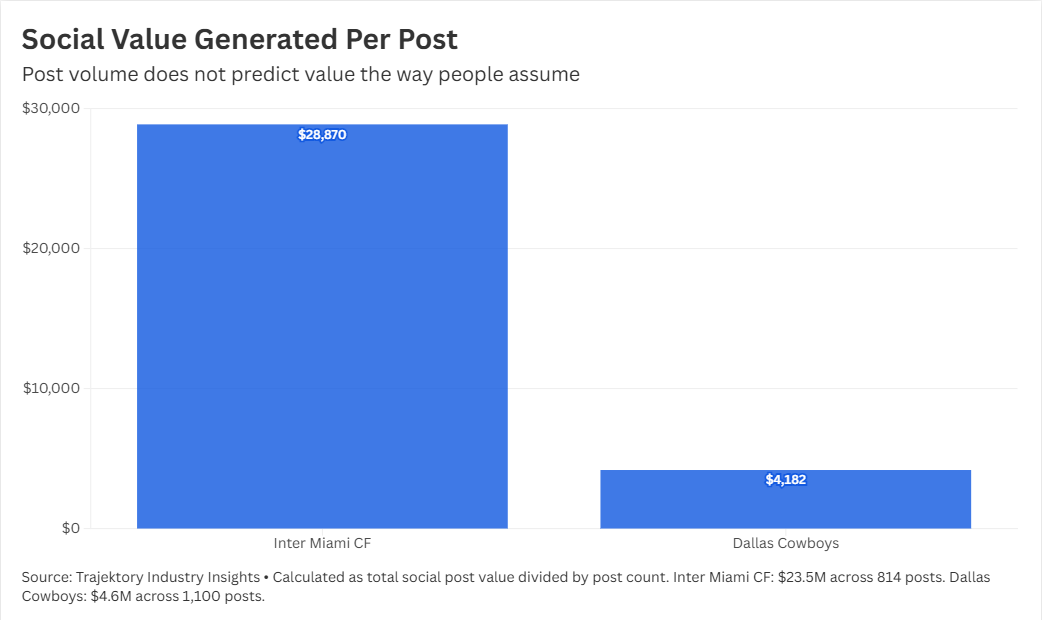
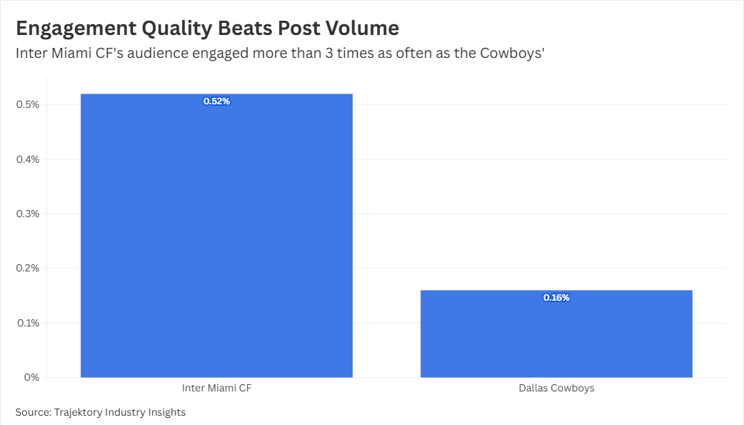
Post volume doesn’t predict value the way people assume. Inter Miami CF generated $23.5M in social post value from 814 posts. The Dallas Cowboys generated $4.6M from 1,100 posts, more posts, a fraction of the value. Engagement rate tells more of the story than volume does: Inter Miami’s audience engaged at 0.52 percent, the Cowboys’ at 0.16 percent.
Follower count doesn’t predict value either. The Golden State Warriors carry the largest audience in this group at 60.9M followers, yet rank behind several teams with far smaller followings on both social post value and brand value. Size of audience and value of audience are two different measurements, and treating them as the same one is where a lot of valuation goes wrong.
Smaller market teams can out-earn bigger names on a per-asset basis. The Indiana Fever’s average value per 30 seconds of broadcast exposure ($78.0K) actually beats the Los Angeles Dodgers ($44.3K) and the Yankees ($41.2K) in the same data set, despite drawing a fraction of the broadcast audience. Engagement quality and placement context are doing more work than raw reach.
None of this shows up in a standard exposure recap. It only becomes visible once assets are captured consistently and valued on the same methodology across the whole portfolio, which is the entire point of building sponsorship analytics properly instead of assembling it from whatever export each channel happens to offer.
What Good Measurement Looks Like in Practice
A few things tend to separate a mature measurement practice from a pile of exports. One methodology gets applied consistently, not a different valuation logic for social versus signage versus radio. Numbers are explainable: if a partner asks how a value was calculated, the answer is a formula, not a shrug. There’s a portfolio level view, not just per asset recaps, so a brand managing ten properties or an agency reporting across ten clients can compare fairly. And the report leads somewhere. It should make the next negotiation easier, not just document the last one.
Choosing a Platform
When evaluating a sponsorship analytics platform, whether you’re a rights holder, a brand, or an agency reporting across clients, the useful questions are less about feature checklists and more about coverage and defensibility. Does it measure every asset type your partnerships actually include, or only the ones that are easy to automate? Can it separate local, national, and away feeds instead of blending them into one number? Is the valuation methodology explainable, with visible inputs, or does it hand you a single figure with no audit trail? Does it produce a portfolio view across partners and properties, not just isolated recaps? And does the output map directly to a pricing or renewal decision, or does someone still have to translate the dashboard into a story before it’s useful to anyone?
Where This Leaves You
Sponsorship analytics in 2026 isn’t really about collecting more impressions data. Most teams already have plenty of that sitting in spreadsheets nobody opens twice. It’s about building one consistent methodology that turns fragmented exposure across every asset and feed into a value story a partner will actually trust. The Fever versus Yankees comparison above is a good reminder of why that matters: the team with the bigger name and the bigger audience isn’t automatically the one generating the bigger number, and you only find that out if you’re measuring everything the same way.
If your own reporting looks like that 30 day snapshot, nearly all value concentrated in the one or two channels that happen to feed cleanly into your dashboard, that’s the place to start closing the gap.
Trajektory built this platform to close exactly that gap. We bring digital and non-digital exposure together into one consistent methodology, so a broadcast window, a social post, and a signage placement can all be measured on the same terms and rolled up into a single defensible number. Whether you’re tracking one asset feed or reporting across an entire partnership portfolio, Trajektory is built to make every dollar of sponsorship value traceable, comparable, and ready for your next renewal conversation.